
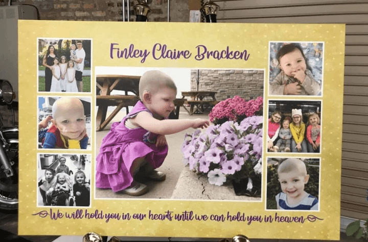
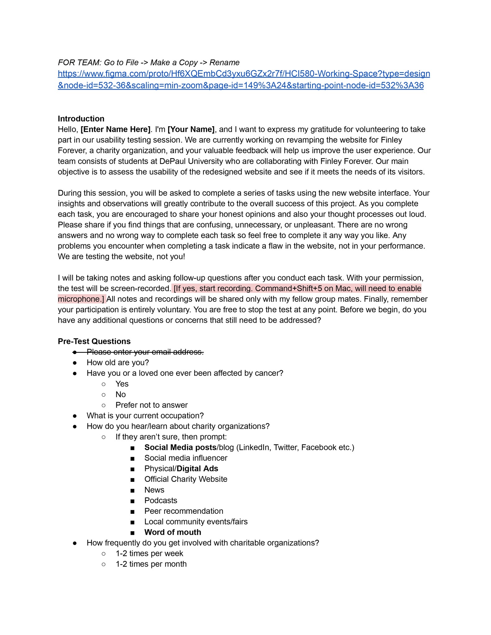
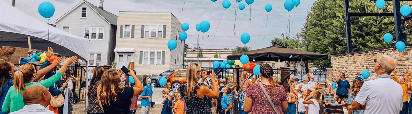
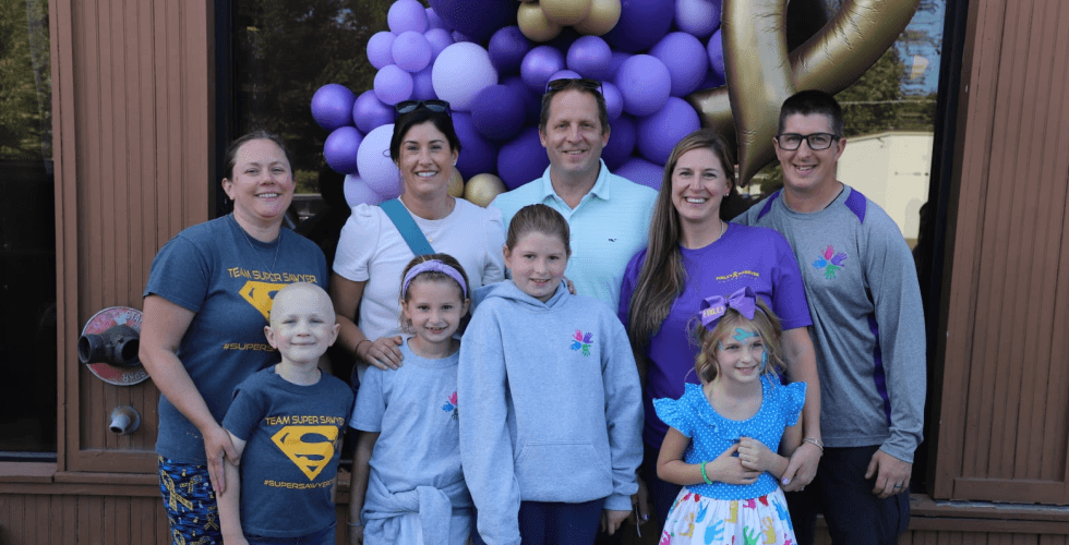
Our team partnered with the Finley Forever Foundation, which is a nonprofit established to honor Lacey’s daughter, Finley, who lost her battle with neuroblastoma cancer back in 2020. Today, the foundation provides support to young oncology patients in the Chicago area, and they offer families financial assistance and much more. Our team was specifically drawn to this project because we were moved by Lacey’s story and the learning opportunities that this project presented.
As a UX Designer, I played a pivotal role throughout its various phases. My contributions included:
Conducting user interviews
Creating surveys
Visualizing data
Developing wireframes
Building prototypes
Crafting presentations
...and more.
What we noticed
The foundation's website suffered from a barebones appearance and functionality, significantly impacting user engagement due to its lack of modern design elements and user-friendly organization. This outdated approach not only deterred users but also reflected poorly on the foundation's image. Additionally, the inconsistent branding and style across the site further diminished the foundation's professionalism and its ability to establish a cohesive brand image.
Moreover, the merchandise purchasing process was notably inefficient, requiring visitors to contact Lacey via email, which complicated and potentially discouraged purchases. The donation process also presented challenges; it was overly simplistic, lacking in detailed information and options, thereby limiting the foundation's outreach capabilities.
Addressing these issues was crucial, especially considering the limited resources available in terms of time, budget, and manpower. Finding cost-effective solutions to streamline these time-consuming processes was essential for alleviating Lacey’s workload and developing a new, sustainable system for the foundation.
What we did
The foundation's website functionality and appearance underwent a significant enhancement. The team revamped the design, reorganized the content, updated the visuals, and optimized the site for mobile devices, ensuring a seamless browsing experience. This overhaul was aimed at making the site more modern and user-friendly.
In parallel, efforts were made to increase engagement and impact. This included incorporating clear calls-to-action, such as donation buttons and volunteer recruitment forms, to encourage visitor participation.
A branding and style guide was established, ensuring consistent branding across all pages and promotional materials. Additionally, the merchandise and donation processes were streamlined, simplifying the user experience and saving Lacey’s time and effort. The team focused on creating time and cost-effective solutions, staying within budget while reducing manual effort and introducing automation.
This strategic approach provided the necessary flexibility for future growth, equipping the foundation with guidelines, resources, and templates for ongoing website updates and expansion.
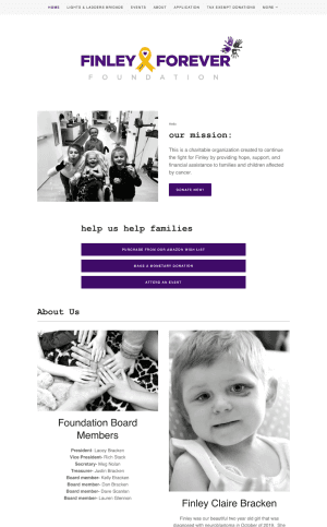

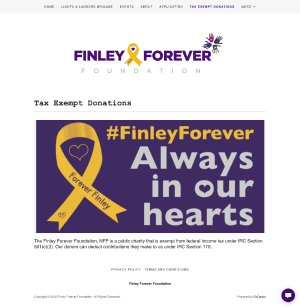
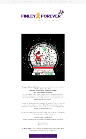
Design of the previous website

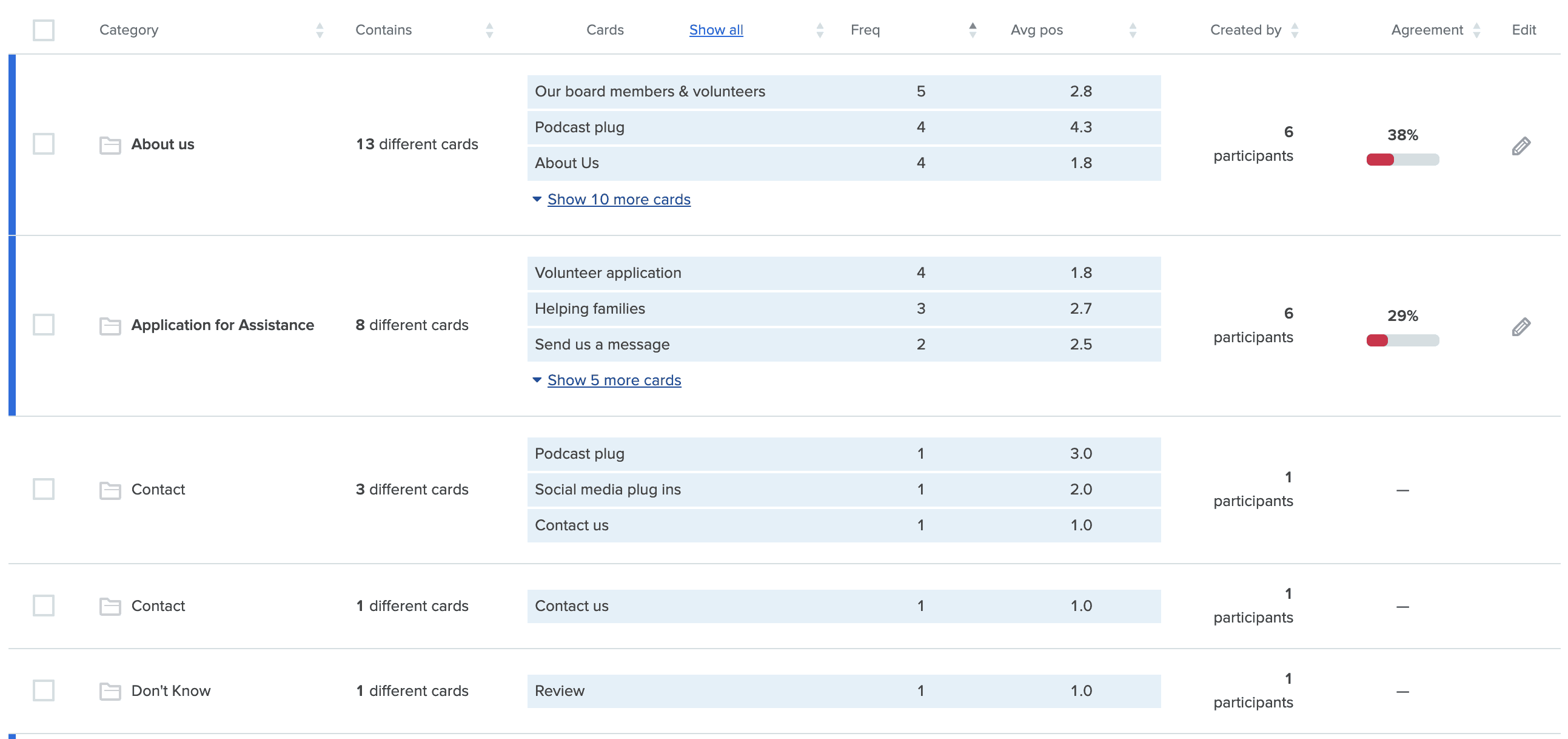
Content Inventory

Proposed Sitemap
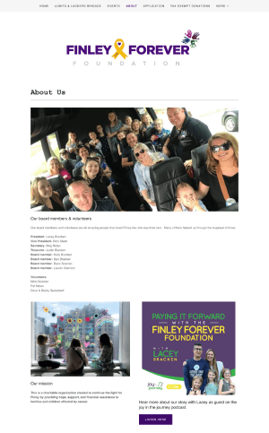
1. About Us
To tell Finley’s story and highlight ways the foundation makes a difference.
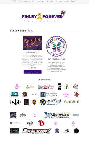
2. Events
To increase awareness about the upcoming and major events hosted by the foundation.
3. How to Help
To promote information about donating, sponsoring, volunteering, and contributing to stem cell kits.
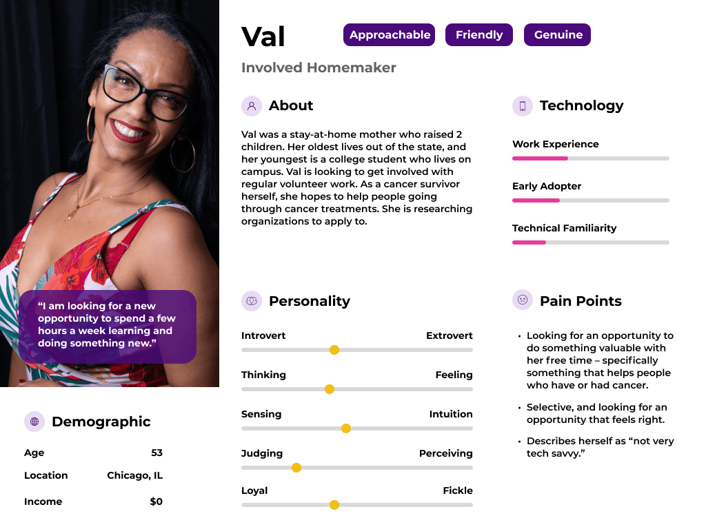
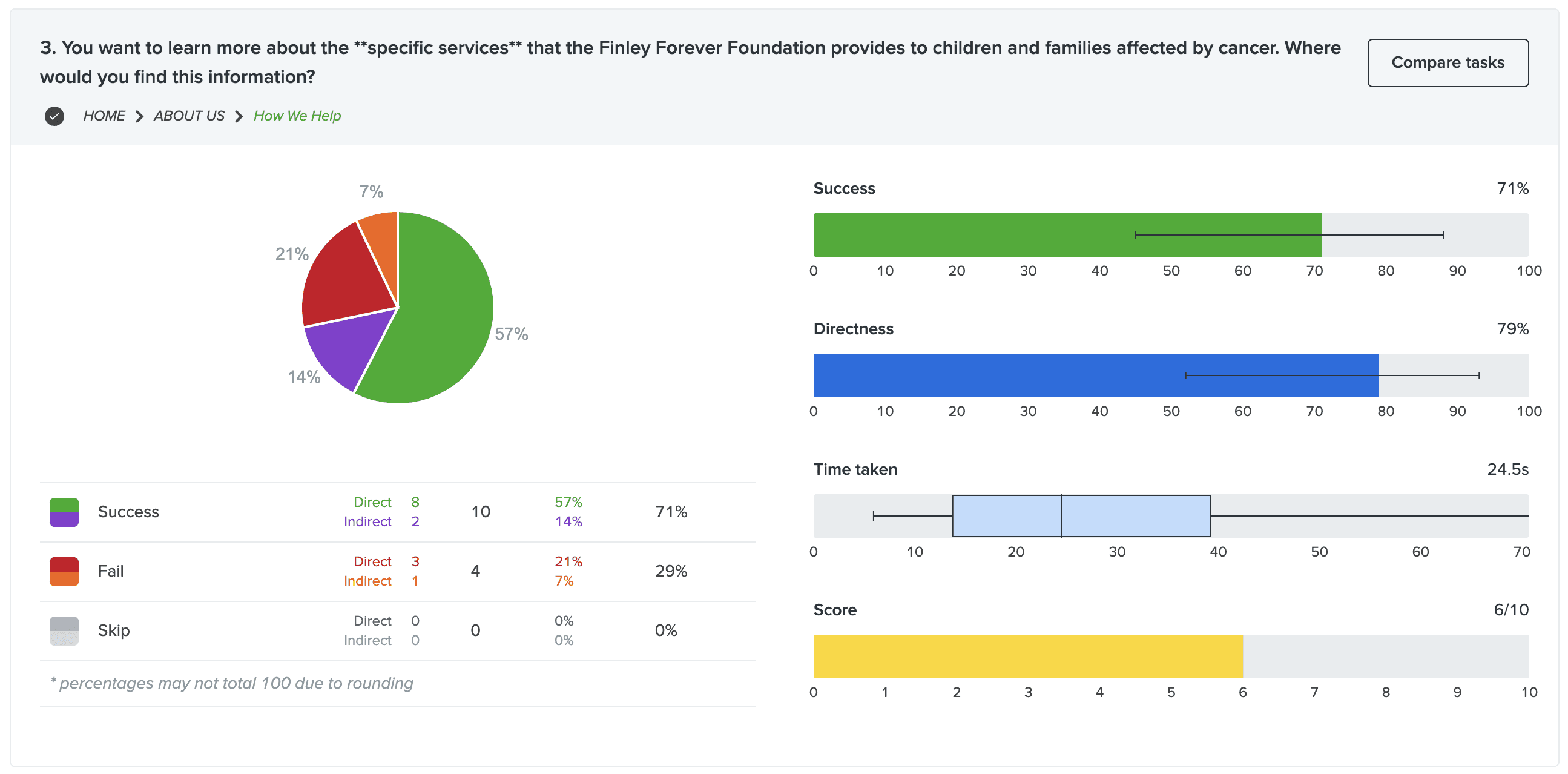
We defined 5 key users. Each persona has a unique motive and is interested in a different aspect of the website. These personas served as a basis behind our tree and usability testing tasks.


Pre-Test
We wanted to note participant age, volunteer experience, and relevant background regarding cancer.
During Testing
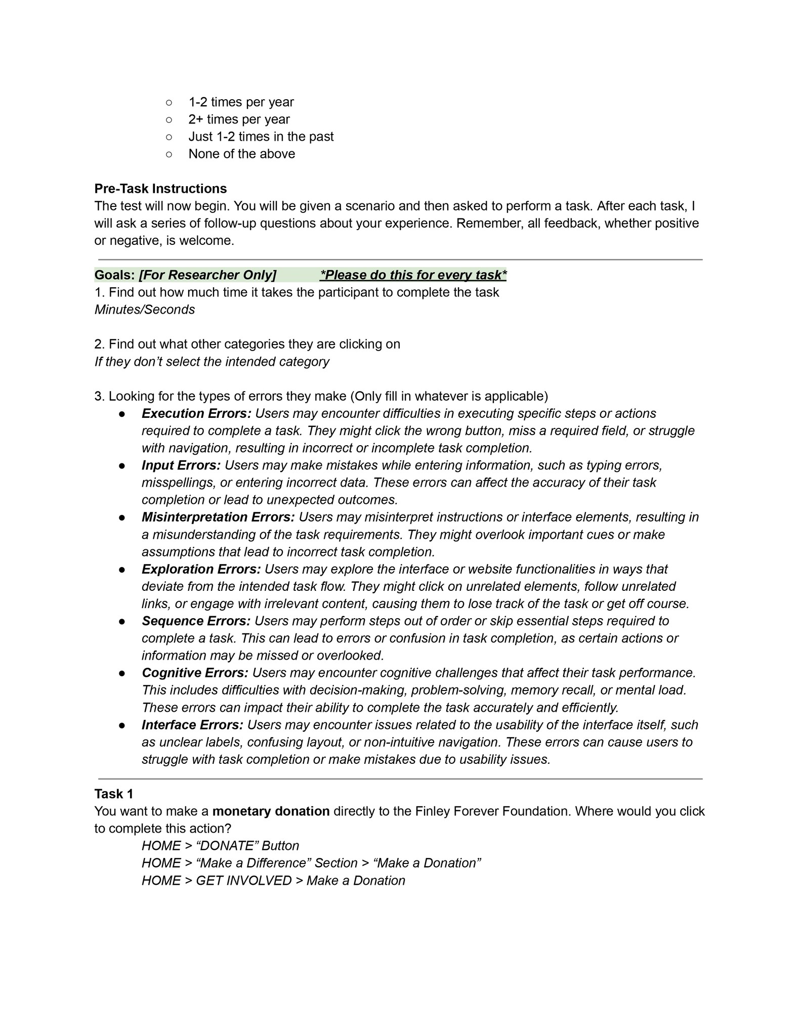
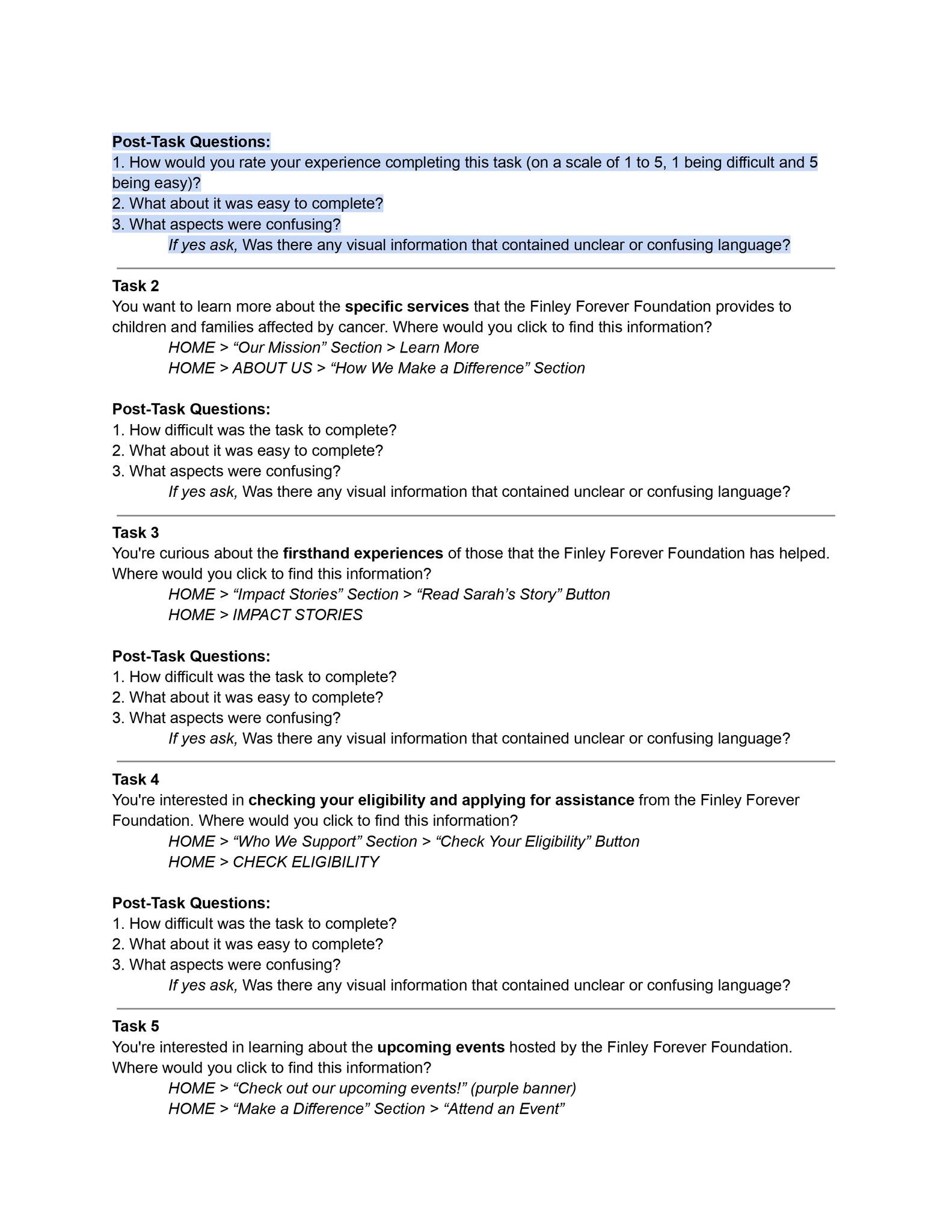
We wanted to test if participants are able to find information related to making a monetary donation, signing up for volunteering, finding information about services offered by the foundation, reading impact stories, contributing towards canvas kits, learning about upcoming events, and applying for assistance.
Post-Test
We asked for participants feedback after every task to understand what worked and what did not.

Picking a platform
In an effort to enhance the website, alternative templates were explored on a free domain, which facilitated the generation of fresh ideas and helped overcome previous limitations. A focus on modern designs and customization led to the discovery that Wix offers more contemporary designs along with a user-friendly drag-and-drop editor, allowing for better customization. Wix was identified as providing a streamlined and feature-rich experience, thanks to its extensive app market and advanced e-commerce tools. This choice was a research-driven recommendation, made after thorough investigation and in collaboration with Lacey. The team emphasized the importance of setup and configuration in Wix, including designing the website and configuring the store, before the domain transfer. Throughout this process, open communication and collaboration with Lacey were maintained to ensure the delivery of an optimal user experience.
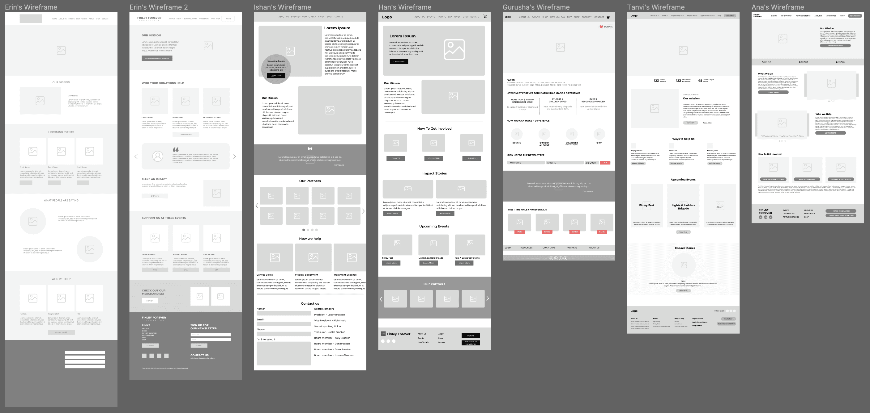
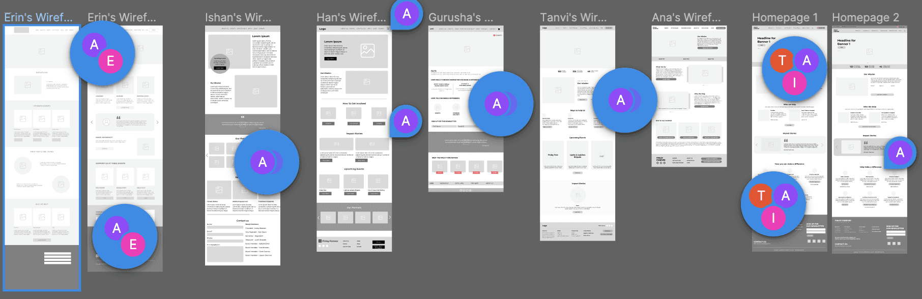
Initial Wireframes
We created Homepage wireframes to guide the development of our website.
Each team member made their own wireframe, resulting in a total of six unique designs for homepage, and we used Lacey’s feedback to refine our designs.
In the end, we combined the best elements and ideas from each page for our final home page wireframe.


Major Feedback:
The onboarding process was too long.
Participants did not like confirmation modals for confirming various actions.
Many interface elements lacked clear icons or labels.
The utility of certain features (Navigate and Community) was unclear.
Changes:
Added a progress bar to the onboarding screens.
Removed modals to streamline favoriting and changing user preferences.
Modified icons and labels to increase visibility & comprehension.
Added Google/Apple Maps, Instagram, Twitter, and Facebook integration.
Changed the Navigate feature to emphasize exploration rather than navigation.
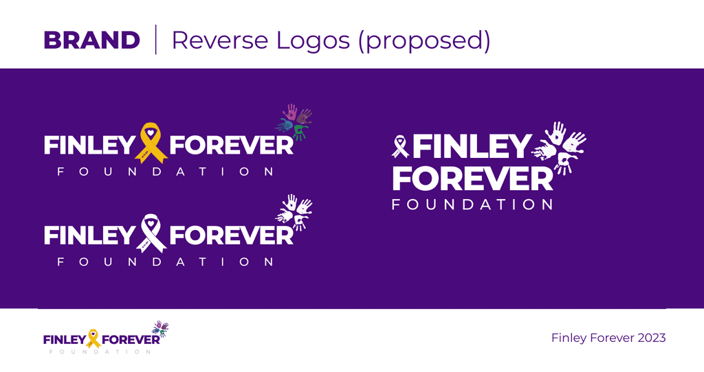
Brand & Styles
When refining the brand, we worked alongside Lacey to make adjustments to the existing logo and expand the logo package so that it can be used in different settings. This includes having both a stacked logo and reverse logo, which is great for use on merchandising and promotional materials.


We used wix.com to deploy the final designs of the website which we deployed live last year. Below is an interactive prototype, or you can view it here as well: https://www.finleyforever.com/
For this project, we wanted the team to have as much positive impact on the foundation as possible. Overall, we were able to meet our goals to consolidate the branding, improve the website user experience, and streamline the digital merchandising experience. To meet these expectations, we establish a strong client relationship with Lacey and ensured clear communication on our process throughout the project. Together, we were able to successfully design and build new pages based on user feedback, and make the website scalable for future features.
If you'd like to read about this project in greater detail, see our presentation.
Thank you for reading!
Ishan Dutta © 2023