This was our HCI program's capstone project. We were free to choose our topic except for a food delivery app or a transportation app. As a UX Designer, I played a pivotal role throughout its various phases. My contributions included:
Conducting user interviews
Creating surveys
Visualizing data
Developing wireframes
Building prototypes
Crafting presentations
...and more.
Problem
One of the defining characteristics of the City of Chicago is its ample public parks and greenspaces. However, there is no easily accessible source of information about park amenities, activities, events, and more.
Solution
Our goal for this project was to design a product that offers Chicago residents and visitors an easily accessible hub of information about the city’s public parks and green spaces.
Tools
Figma & FigJam
Optimal Workshop
Qualtrics
Google Docs & Slides
Zoom
My Role
Assisted UX Design & Research.
Created User Journey verbiage.
Created surveys and interviews.
Created scripts for presentation.
Timeline
Overall: 11 weeks
Discovery & Research: 5 weeks
Design & testing: 6 weeks

1. Discovery
What's the deal?
Parks are a vital resource that allows people to build an increased sense of community and place.
Research has shown health benefits in individuals who visit parks with ample green space.
The knowledge of park information increases accessibility, which is a critical factor in predicting park usage.
Though Chicago's parks enjoy consistent use, increased awareness of what they offer visitors could increase park attendance.
Having identified our problem space, we conducted a competitive analysis to explore similar products:
We found 3 competitive products that were similar to our idea.
All lacked the accessibility and feature set we had in mind.
Several competitors focused either only on parks or events.
Takeaways
Our competitive review exposed an opportunity to provide users with an informative mobile application experience. We identified the following benefits that our interactive park application can provide:
Improved community engagement due to increased park awareness
Recommendations based on user preferences
Opportunities for learning from easier access to park information

2. Research
To begin understanding our potential users, we conducted user interviews with 9 participants. These findings helped us understand our potential users.
Techniques: Interviews, Affinity Diagrams, Informed Consent Forms, Interview Protocol.
Tools: Zoom, FigJam
Outcome: We gained meaningful insights on
What people like to do when they visit parks
How do they hear about events happening in the parks
How they travel to the parks
Current pain points

To collect quantitative data about user preferences and behaviors, we conducted a survey with 28 respondents. These findings helped us understand our potential users.
Techniques: Surveys, Affinity Diagrams
Tools: Qualtrics, FigJam
Outcome: We gained meaningful insights on
How often people visit public parks in Chicago
How they get there
What activities and events they like to do and take part in
Important factors around visiting parks
What tools do they use when planning a visit
Potential features they'd like to see
Full results from the survey can be accessed via the button below.
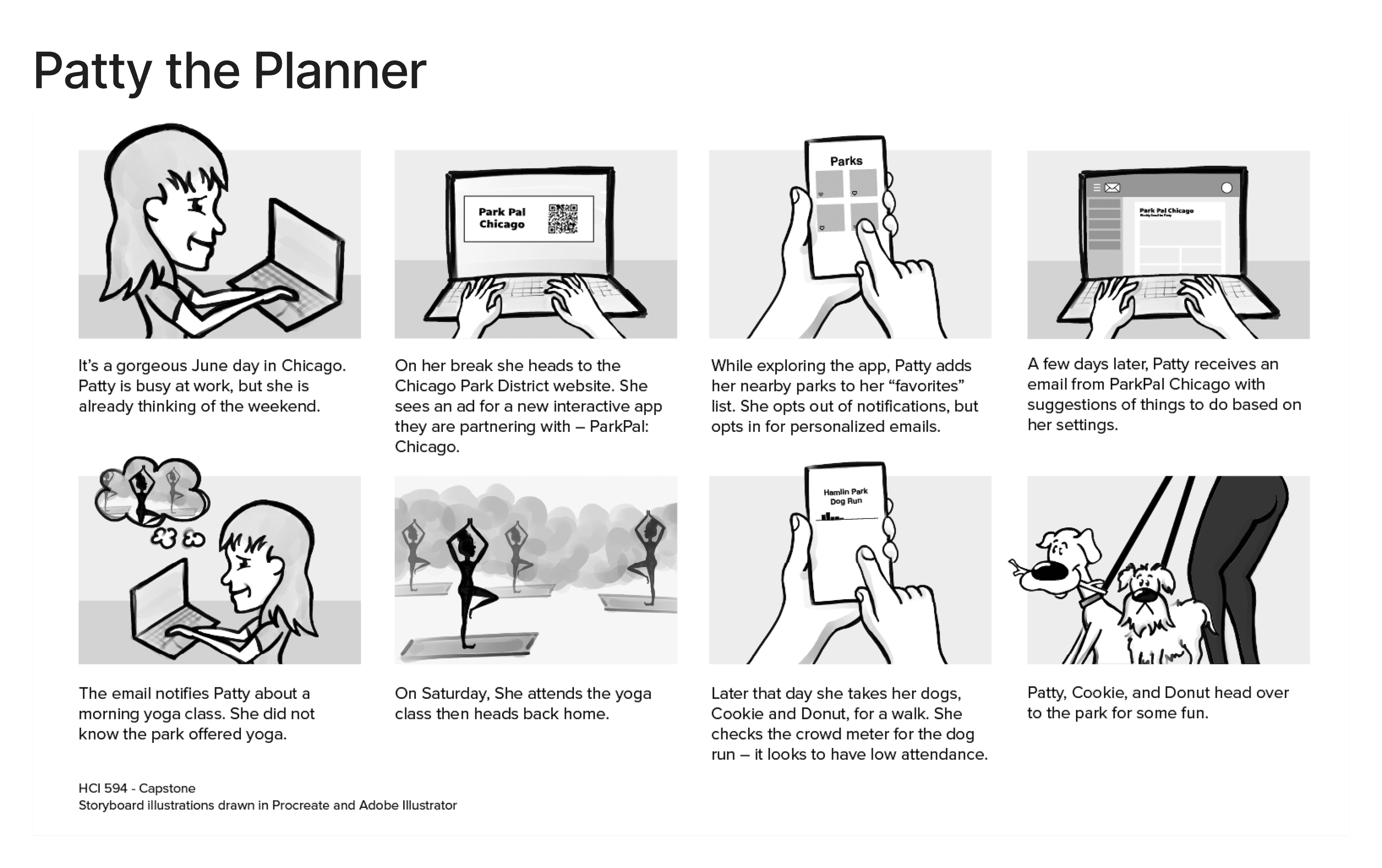
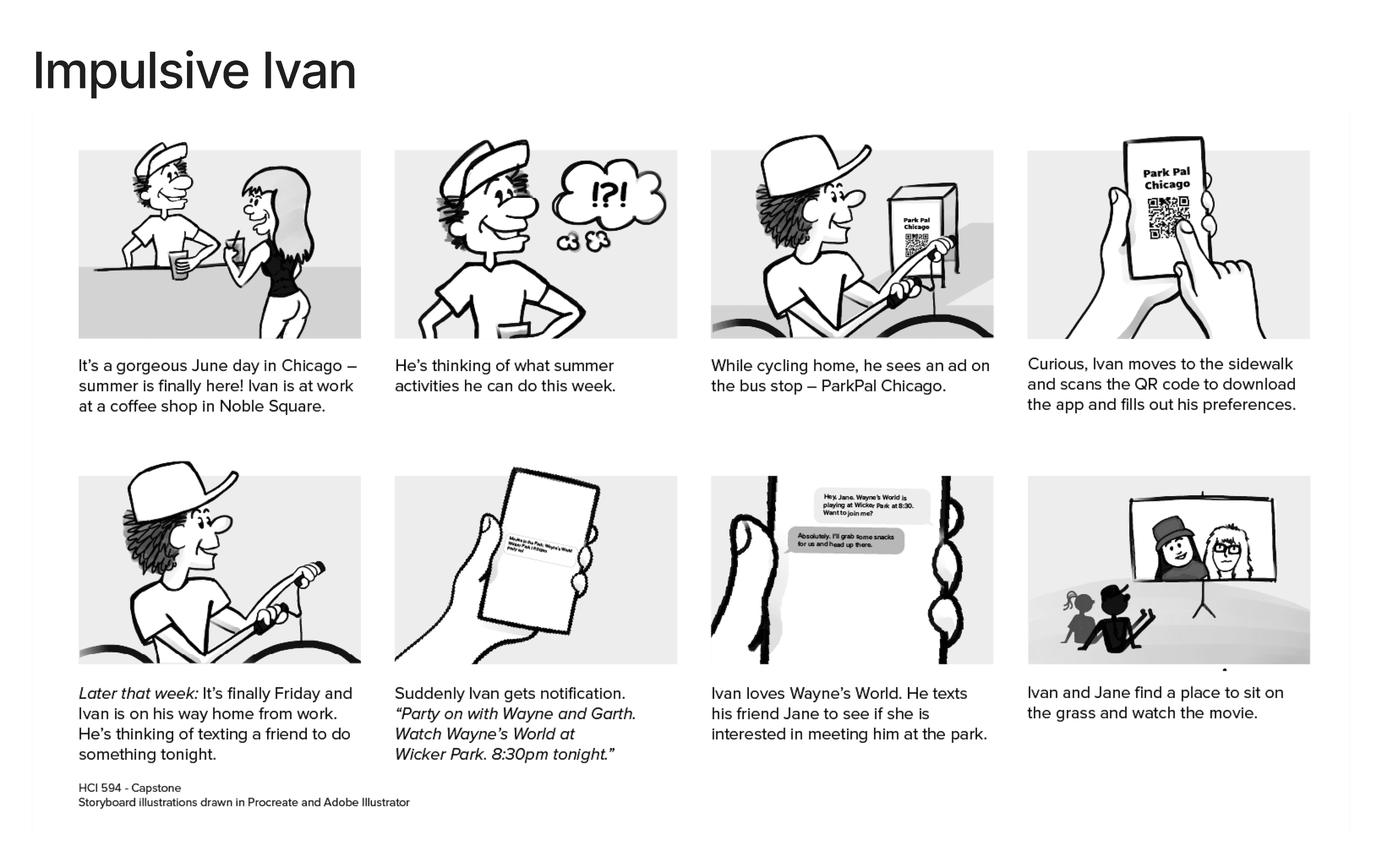
To form a deeper understanding of our users' goals, needs, experiences, and behaviors, we created personas for our two user segments.
Techniques: Personas, Scenarios, Storyboards
Tools: FigJam, Adobe Illustrator
Outcome:
Patty the Planner: Patty has a busy schedule, so she likes to plan her park visits ahead of time.
Impulsive Ivan: Ivan is free-wheeling, preferring to explore and check out whatever he happens to come across.


3. Ideation
Having gained an understanding of our potential users, we began the design ideation process.
We did a design charrette where we all took 5 minutes to come up with ideas on what the app may look like.
Techniques: Design Charrette, Low-Fidelity Prototyping
Tools: Pencil & Paper, Figma
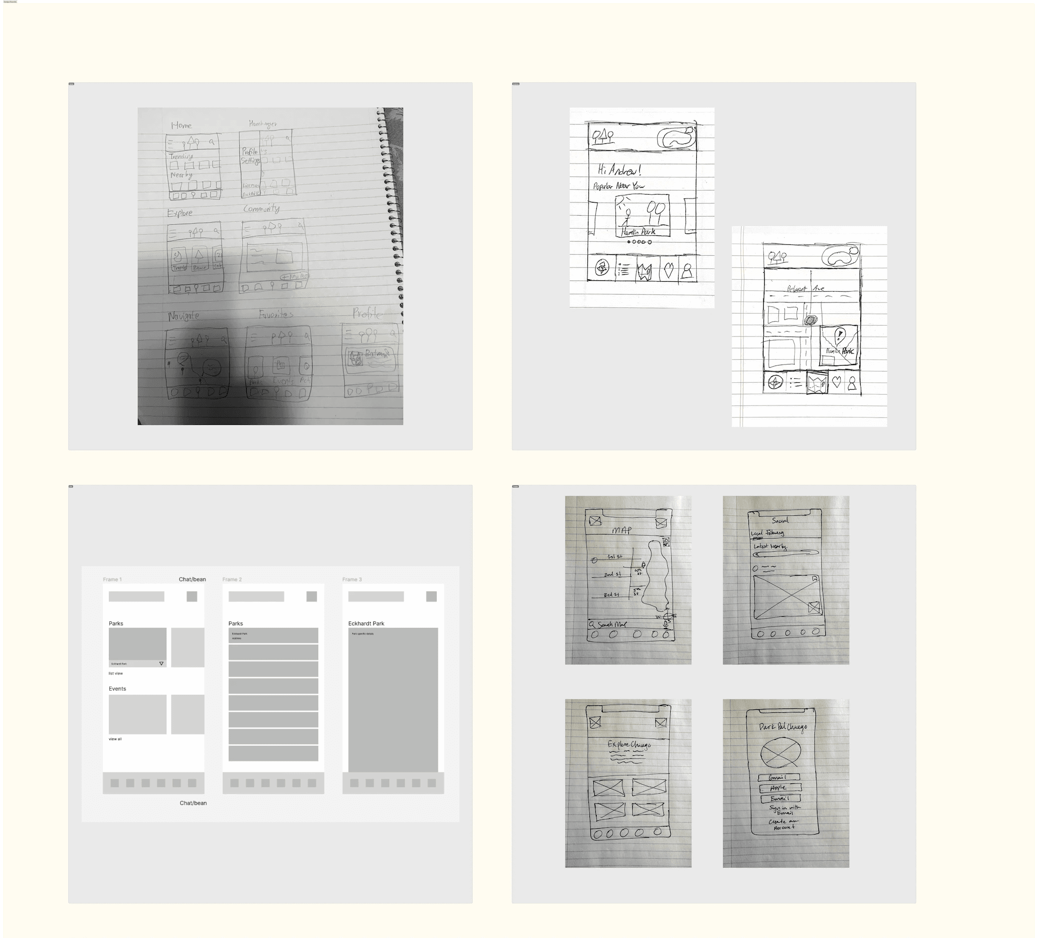

We combined all our ideas to create our initial wireframes for the app
4. Mid-Fi Prototype
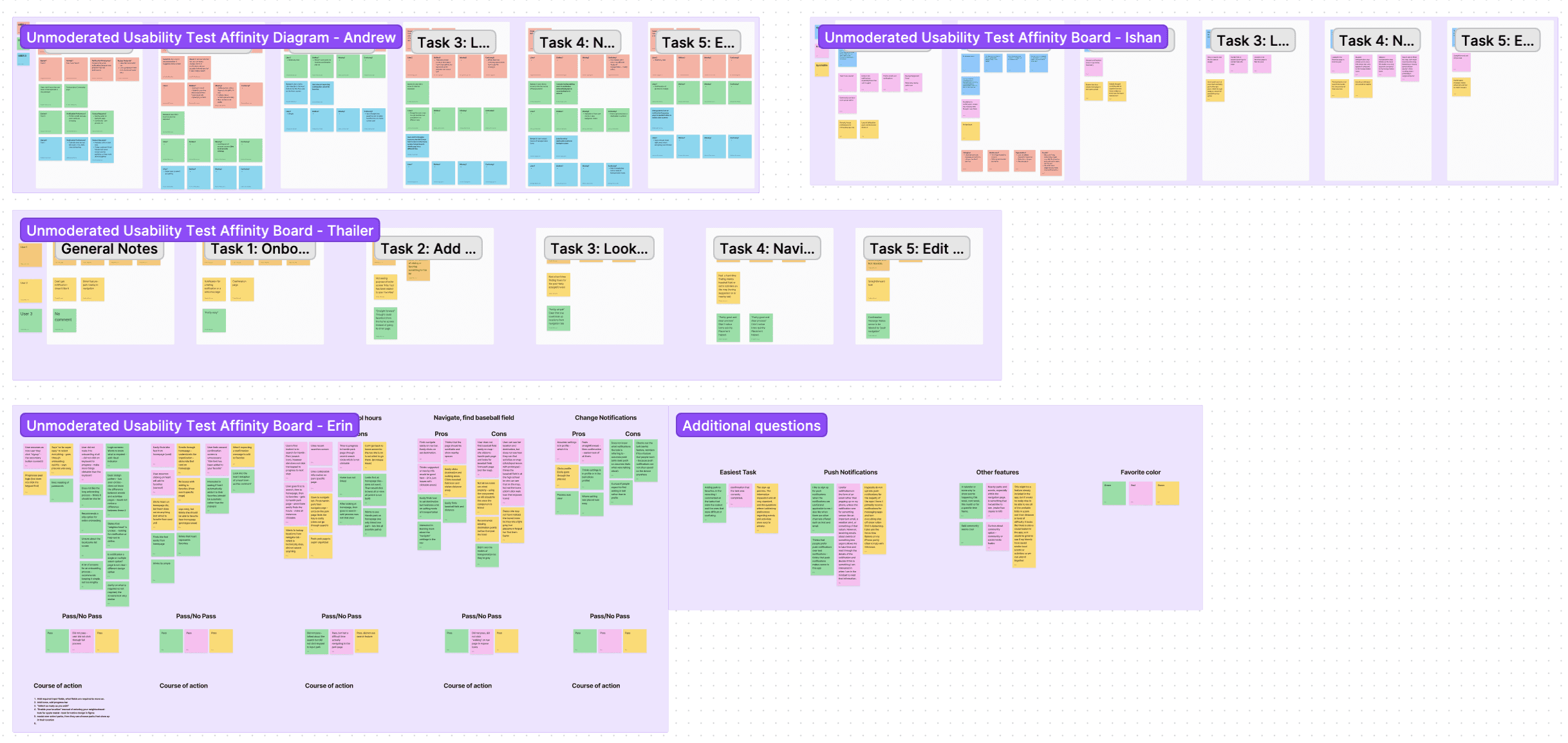
In order to begin testing our prototype, we conducted unmoderated usability testing on 3 users from another project group. We informed these participants of the context of our project via an RFP (Request-For-Proposal), in which we detailed 5 tasks, each with a scenario and a series of follow-up questions.
Techniques: Unmoderated Usability Testing, RFP, Think-Aloud Protocol, Affinity Diagrams
Tools: Zoom, FigJam
Outcome: Each team member watched the recordings separately and created an affinity diagram of the results. We then met as a group to discuss our findings and determine what changes were required.
Major Feedback:
The onboarding process was too long.
Participants did not like confirmation modals for confirming various actions.
Many interface elements lacked clear icons or labels.
The utility of certain features (Navigate and Community) was unclear.
Changes:
Added a progress bar to the onboarding screens.
Removed modals to streamline favoriting and changing user preferences.
Modified icons and labels to increase visibility & comprehension.
Added Google/Apple Maps, Instagram, Twitter, and Facebook integration.
Changed the Navigate feature to emphasize exploration rather than navigation.


High-Fidelity Prototype
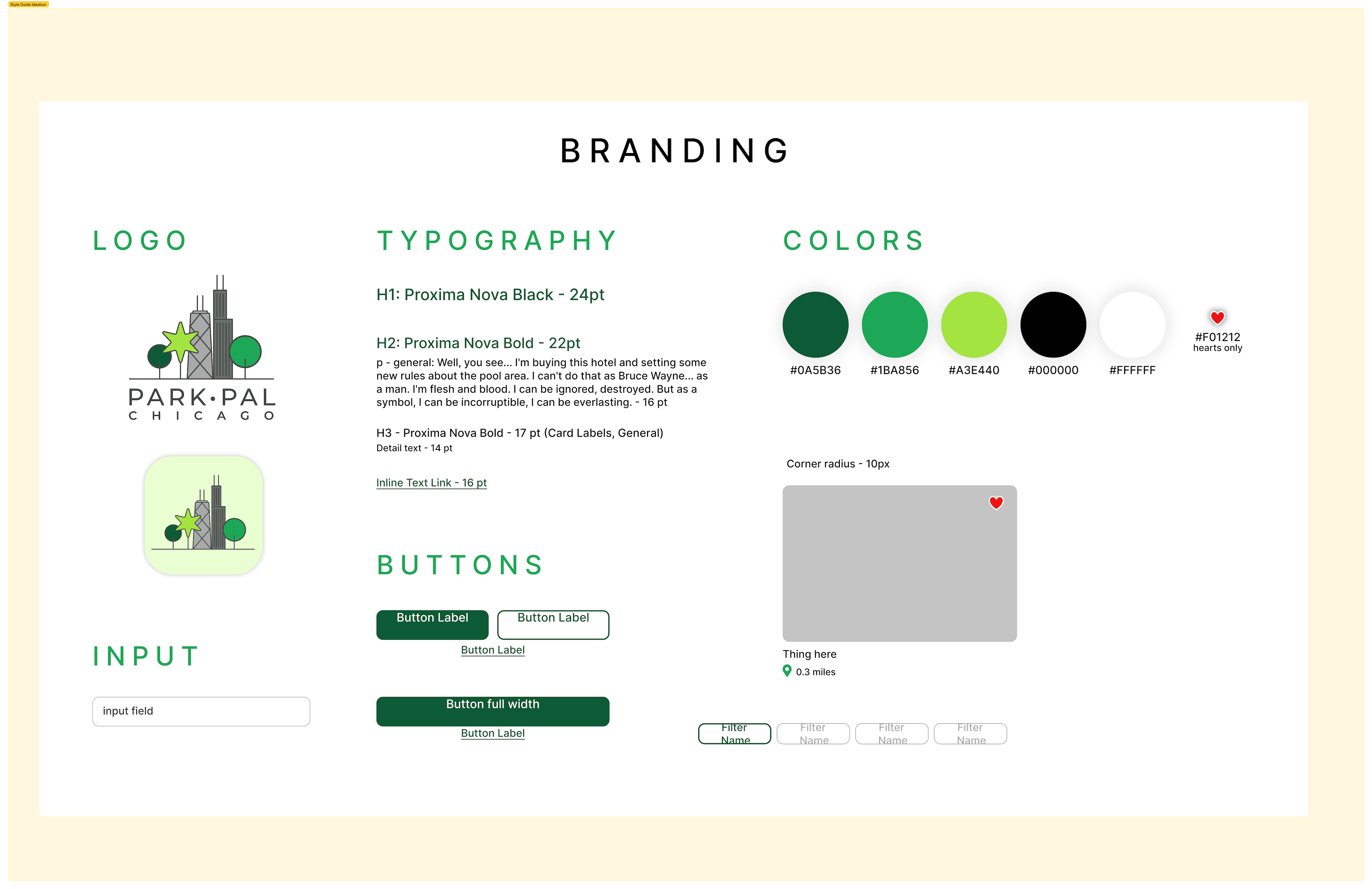
Brand & Styles
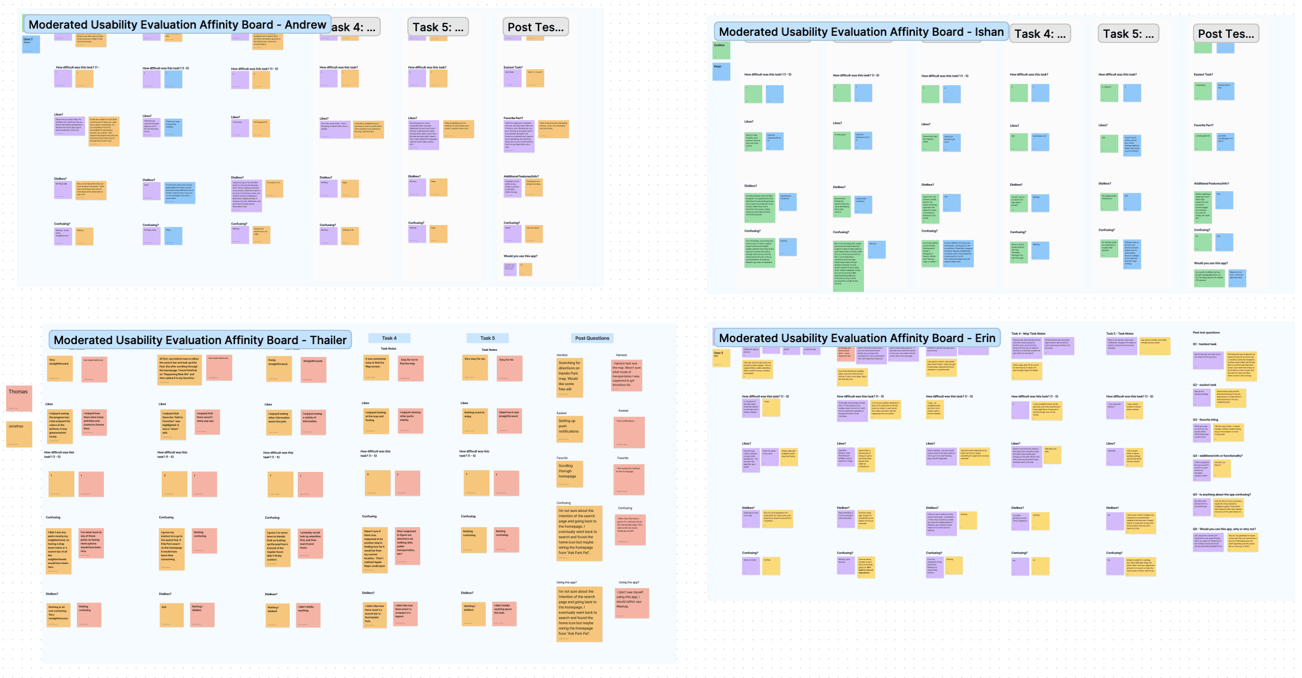
In order to get the final validation of our hi-fi prototype, we conducted a moderated usability evaluation on 8 users.
Techniques: Moderated Usability Testing, Think-Aloud Protocol, Affinity Diagrams
Tools: Usability Test Script, Zoom, FigJam
Outcome: After all eight sessions were completed, each team member re-watched the session recordings and created an affinity diagram for the sessions they facilitated. We then met as a group to discuss our findings and determine what changes were required.
Once we implemented the changes from the moderated usability evaluation, we were able to produce our final hi-fi prototype.
Techniques: Wireframing, High-Fidelity Prototyping
Tools: Figma
This was a great opportunity for me to apply all the knowledge and skills that I learned in DePaul's HCI program.
The self-directed nature of the capstone course allowed my team to progress through the UCD process from start to finish however we saw fit, and it provided me a glimpse of how UX projects are carried out in the real world.
I thoroughly enjoyed working with my teammates, and I am extremely proud of what we were able to accomplish.
If you'd like to read about this project in greater detail, see our presentation and final report.
Thanks for reading!
Ishan Dutta © 2024