Disclaimer: All pictures were recreated in Figma as the actual reports contain sensitive information so the pictures don't represent the exact design & style compared to the actual PowerBi report.

Report Hub
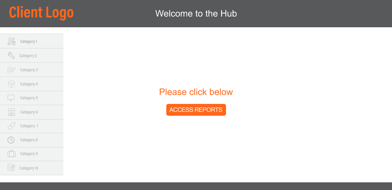
I had worked on creating a centralized report hub which is currently accessed by more than 5000+ users. This was a much-needed requirement for our client as we had over 15 reports deployed to production, but we had to manually share each report link with each employee every time we updated a report. So in order to mitigate this, we thought of a one-stop-shop solution and created a report hub that would only show the reports based on the employee's access level.
Here's how the process works:
Step 1
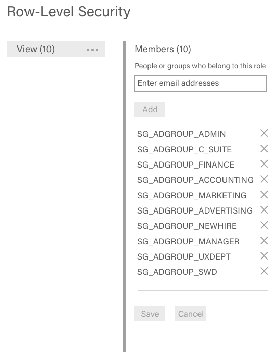
Employee opens the report which has RLS (Row-Level Security) implemented.
Step 2
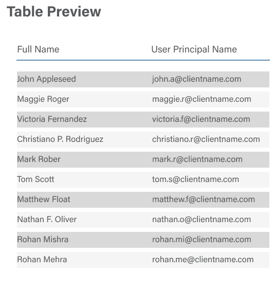
Our backend checks the employee email they logged in with.
Step 3
The User Principal Name is checked with the AD (Access Directory) group they have access to.

Step 4
Based on this RLS check, they are taken to the page they have access to.
Step 5
The employee can then open the reports accordingly.

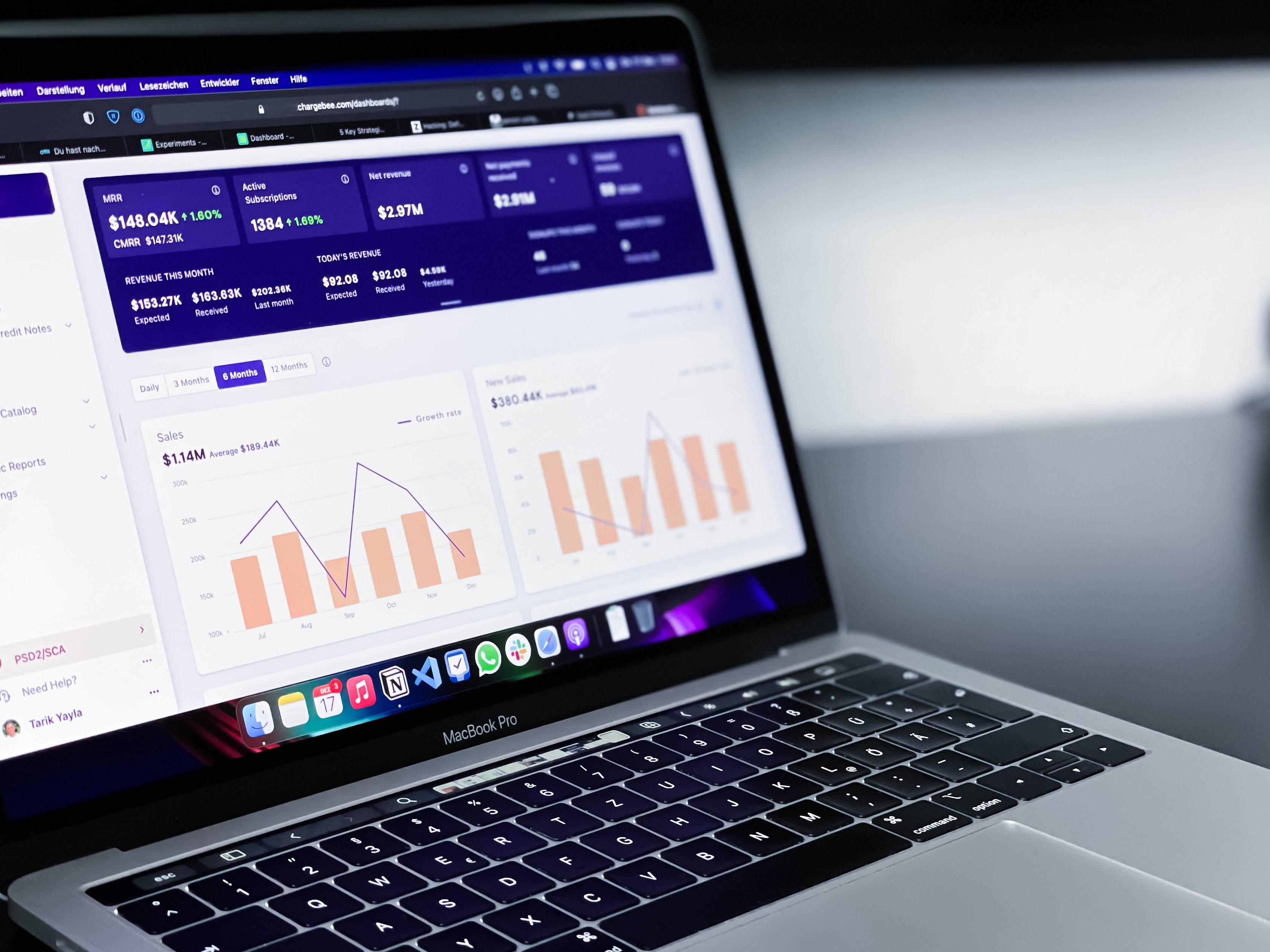
Customer Profitability

In developing the customer profitability report, our objective was to provide the client with an in-depth brand loyalty analysis. The report aimed to offer insights into customer performance, identify top-performing products, and analyze Sales and Gross Profit (GP). It also explored the performance of various products compared to the total business sales, tracked the number of canceled orders, quantities sold, and total orders placed compared to the previous month, and more.
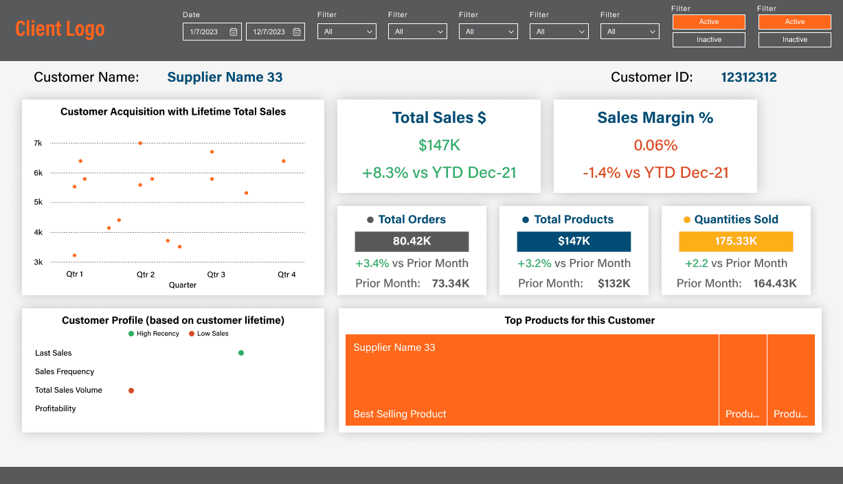
The complexity of this project lies in identifying and integrating the appropriate Key Performance Indicators (KPIs) to meet the client's needs. To achieve this, we conducted multiple design thinking sessions. These meetings were instrumental in understanding the client's requirements and expectations. In each session, we presented our current progress and gathered additional insights. This iterative process, consisting of presenting, reviewing, and refining, was essential for aligning our objectives with the client's vision.
Supplier Dashboard

In this report, I developed a dashboard to display comprehensive supplier information for the client. Each supplier provides a file detailing product pricing updates, including the Vendor Effective Date—the date when new prices take effect. Suppliers are required to submit this file at least 14 days before the deadline as per their Service Level Agreement (SLA) with the client. Compliance is categorized as follows: submission more than 14 days before the deadline is "Within Contract", within 14 days is "In Contract Breach", and past the deadline is "Late".
Suppliers are also classified into Tiers based on their annual business contribution. For example, a supplier generating $1M annually falls into Tier 3. The client sets these thresholds, and any changes are correspondingly reflected in the backend.
To evaluate supplier performance, I created a custom vendor score considering three key factors: timeliness of file submission (assessing contract compliance), file quality (identifying cases of incomplete information), and supplier tier. This scoring system enables the client to quickly gauge supplier quality without the need to analyze extensive data from graphs.
KPI Dashboard
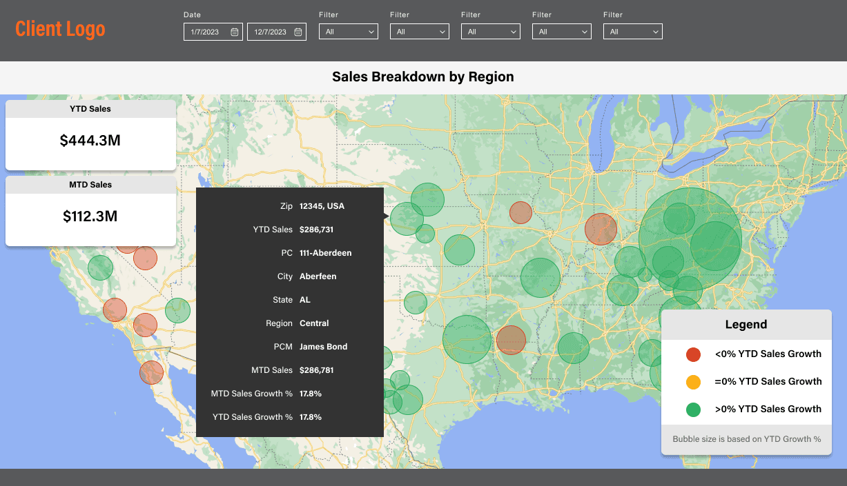
For the dashboard, I developed a region-based map to monitor sales and growth effectively. Previously, our client relied on a labor-intensive process, using an Excel document to manually highlight Profit and Loss (P&L) data. This approach required them to review nearly 20 pages of tables each month. To streamline their decision-making process, they requested a report that would enable quick, data-driven business decisions.
While I created several pages for this report, I have chosen to highlight only the region map here as the other pages were similar in design to the previous examples I've shown.

UI & UX
Design Revamp
Previous consulting firm's dashboard design

Concept design created as a Proof of Concept (POC)
Current dashboard design in PowerBi
Our client ended their engagement with a previous consulting firm due to their inability to deliver modern design aesthetics and push reports to production. I joined the project as a UX Designer and PowerBi Developer, tasked with revamping the existing design for a more modern look and feel. While numerous iterations were made throughout the design process, the final design involved crafting the POC with the capabilities of PowerBi. This approach ensured that the end result was both aesthetically pleasing and functionally robust.
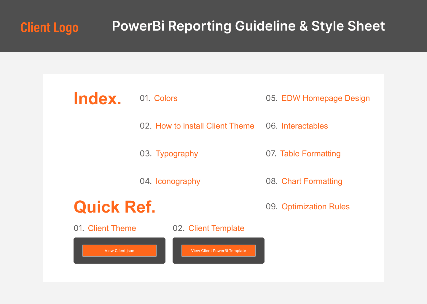
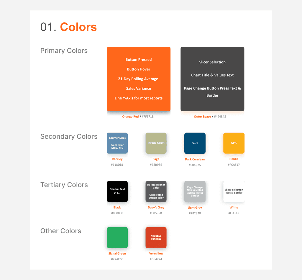
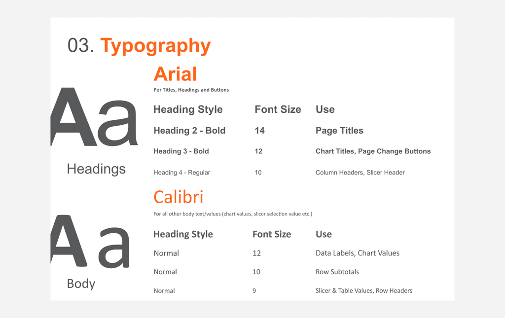
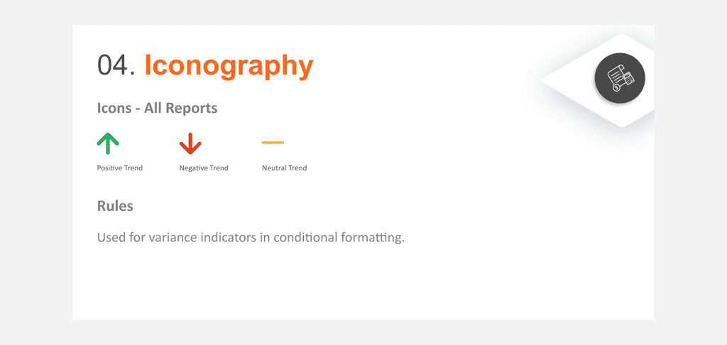
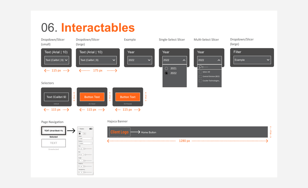
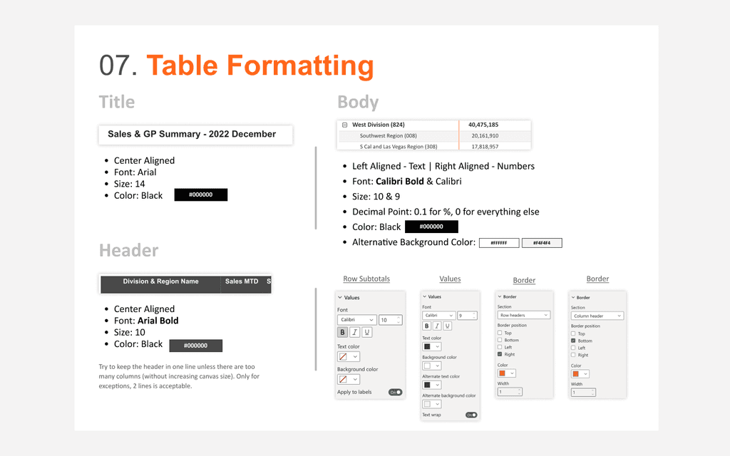
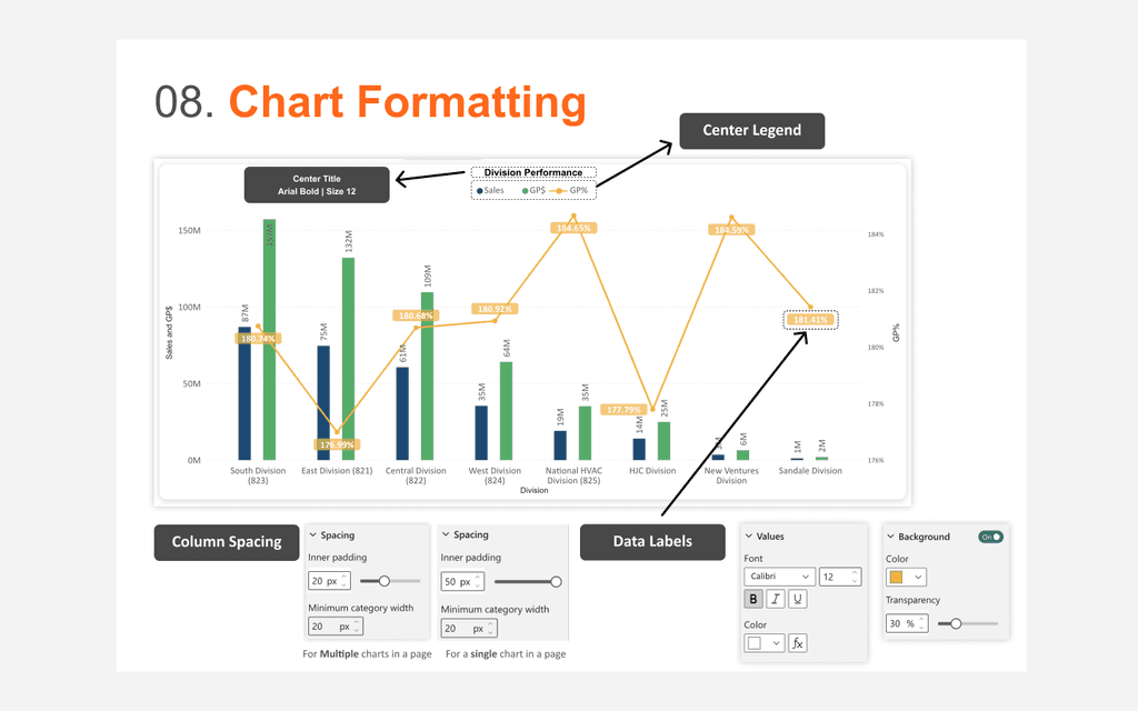
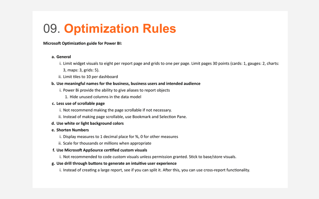
UI Visual Guideline for PowerBi

To ensure design consistency across our PowerBi projects, I developed a set of brand guidelines tailored for our PowerBi team. These guidelines are designed to maintain a cohesive look and feel for all our client reports. They address various aspects unique to both the client's specific needs and PowerBi's conventions, diverging somewhat from traditional design guidelines. This approach helps in delivering visually consistent and client-centric dashboard designs for all the reports.


Design Thinking

I was part of TCGD's Design Thinking team and assisted in creating the playbook that was distributed to all portfolio managers in the company to use. The playbook offers a comprehensive overview of design thinking as a problem-solving approach, emphasizing user needs, creativity, prototyping, and iterative design. It highlights the importance of empathy, collaboration, experimentation, and user-centric innovation.
The design thinking process is outlined, including empathizing with user needs, defining problems, ideating solutions, prototyping, and distilling feedback. This process aims to prioritize user needs, encourage creative solutions, and foster a structured approach to complex challenges.
Several use cases and design thinking tools are mentioned, providing practical applications of the concepts. The document also includes a section for fun exercises, and an incremental release plan for implementing design thinking in the organization.
Finally, it covers scenarios for ideation and post-project award phases, detailing a step-by-step guide like setting objectives, assembling teams, empathizing with users, defining problems, ideating solutions, prototyping, and gathering feedback to refine and validate the solutions.
We hosted 2 design thinking workshops (one in-person and one online) to refine the playbook. Once we created our final version of the playbook, we hosted 2 training sessions for our managers and portfolio leaders. These training sessions were about 2 hours long each and helped us gather feedback to streamline the playbook even further.
